How to use Market Profile to trade profitably

Market Profile was first developed by Peter Steidlmayer. They are an approach to study the behaviour of market for last couple of days and based on that analysis decide further course of action. Market profile is a histogram chart of “batched time” vs price. Price is plotted on the Y axis and batched time on the X axis. This is very different from the charts which we are very used to seeing where time is continuous variable. Market Profile attempts to understands the fair value of a stock via peeking at the amount of time it spends on a particular price. The price at which the stock/ commodity/ index spends the most time is referred to as the Time Price Opportunity (TPO). This is considered the fair value of that underlying for that day.
You can compare this to any everyday example as well. Suppose you have gone to the market to buy an item whose fair value is not known to you. All market participants are buying the same based on their utility for the product and price asked by the seller. But there is a wide range of the price by the same seller. You decided to wait and observe the price & customer’s buying behaviour to understand the fair value of the product. The seller keeps changing the price based on the demand dynamically. You also observe, the prices kept moving during the day and suddenly at a certain price there were no buyers and the shopkeeper had to reduce the price to restore balance.
You meticulosly plotted the activity for the several days observations and to your surprise, it turned out to be a normal curve. If you had continued your study for a month, you probably will observe following things:
- You can observe a normal curve on several specific day.
- The fair value or the mean of the curve was rising every day Indicating the item was in good demand and it was a trending market for it.
- You also observed, on several days when the prices were not moving down, it stopped moving down below certain prices.
- On most days it was testing an upper boundary prices but was failing to close at the top. It felt like range extension when you look the curve for multi day analysis now.
Something similar happens in the stock market. When you observe things with a bird’s eye view, you will observe the price movements were following similar behaviour. It was erratic on several days but the medium term pattern could be traced from the study.
This is a simplified explanation. Interpreting market profile skilfully needs a trained eye.

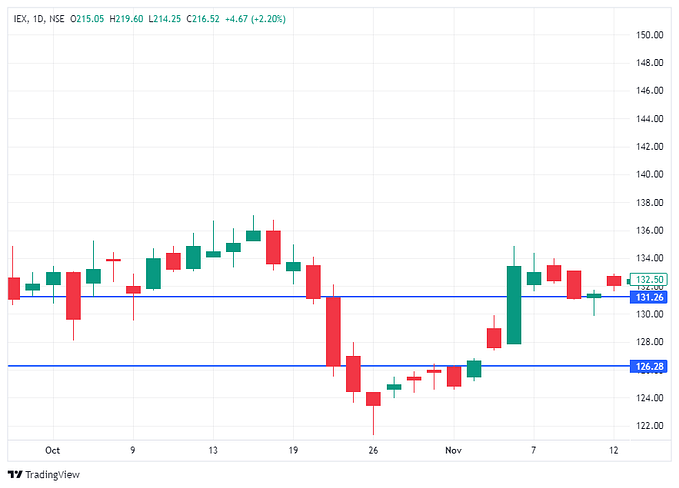
In the above chart, you can observe how the TPO (Red lines) is moving up each month. This depicts that the stock is trending. Also, TPO indicates the most accepted value of the stock in a given month.

It is common to use the 30 minute interval to create the chart for a day and also combine it with the volume profile & pivot lines to make a stronger interpretations. We will talk about them in a later post.
Summary
Through market profile, we try to understand following implicit movements and dynamics:
- Supports and resistances (short-term)
- Range Extensions
- Bottom out/ Topping out trends
Once you spend time on reading this chart, you will also start observing the price ranges which are providing supports/ resistances. But the most important utility is to identify if the range extensions on the positive/ negative sides will be momentous or not. You can combine your observations with pivot lines and take a position accordingly.
Nothing in the market is a surety, but this powerful and time tested strategy helps your chances to finding that 10R (10 times rewards to risk ratio) trade- Jackpot trade.


